Author Website Redesign
A self-initiated redesign of a Bengali thriller writer's site: an archive of his books, built around covers and Bengali typography.
Overview
This is a self-initiated concept redesign of an author website for Mohammad Nazim Uddin, a Bengali thriller writer, publisher and translator. I created it independently, without any contact or agreement with the author.
The site is designed as an archive of his work rather than a store. It brings his books, biography and OTT adaptations together in one clear structure, with a dark, cover-driven look that suits the thriller genre. I designed it for desktop and mobile in Figma.
The goal
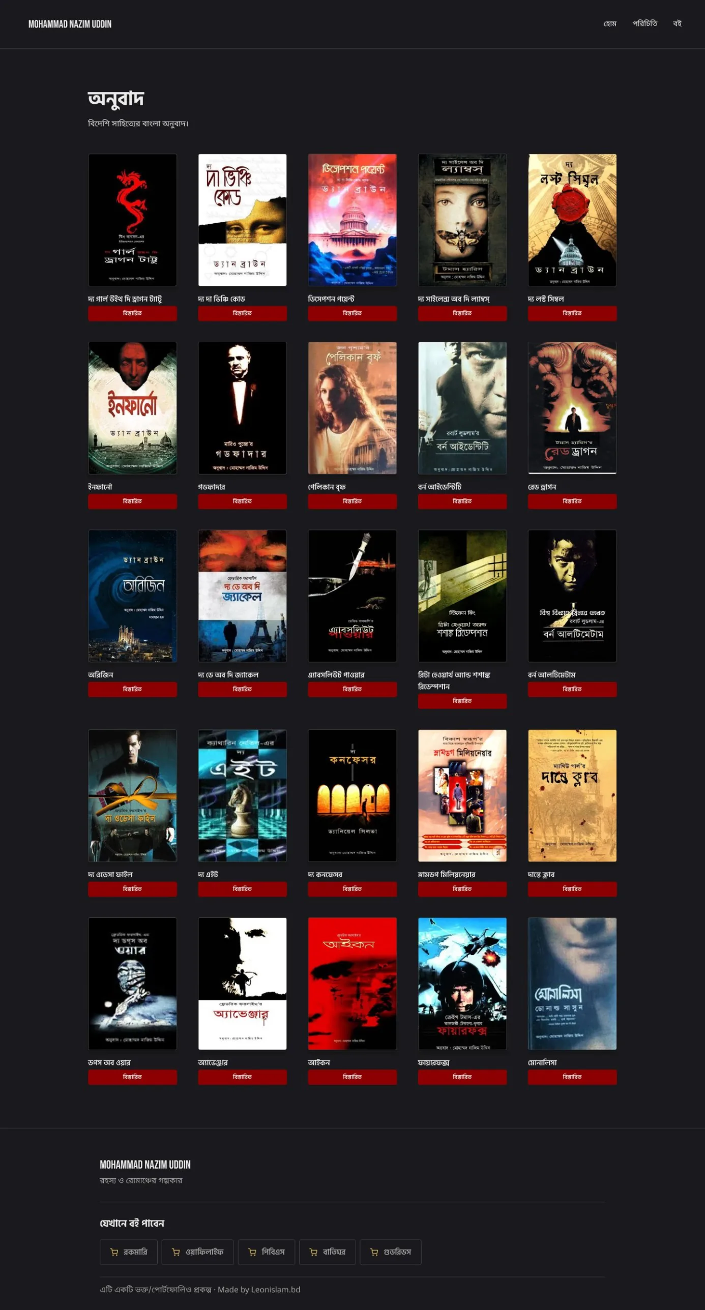
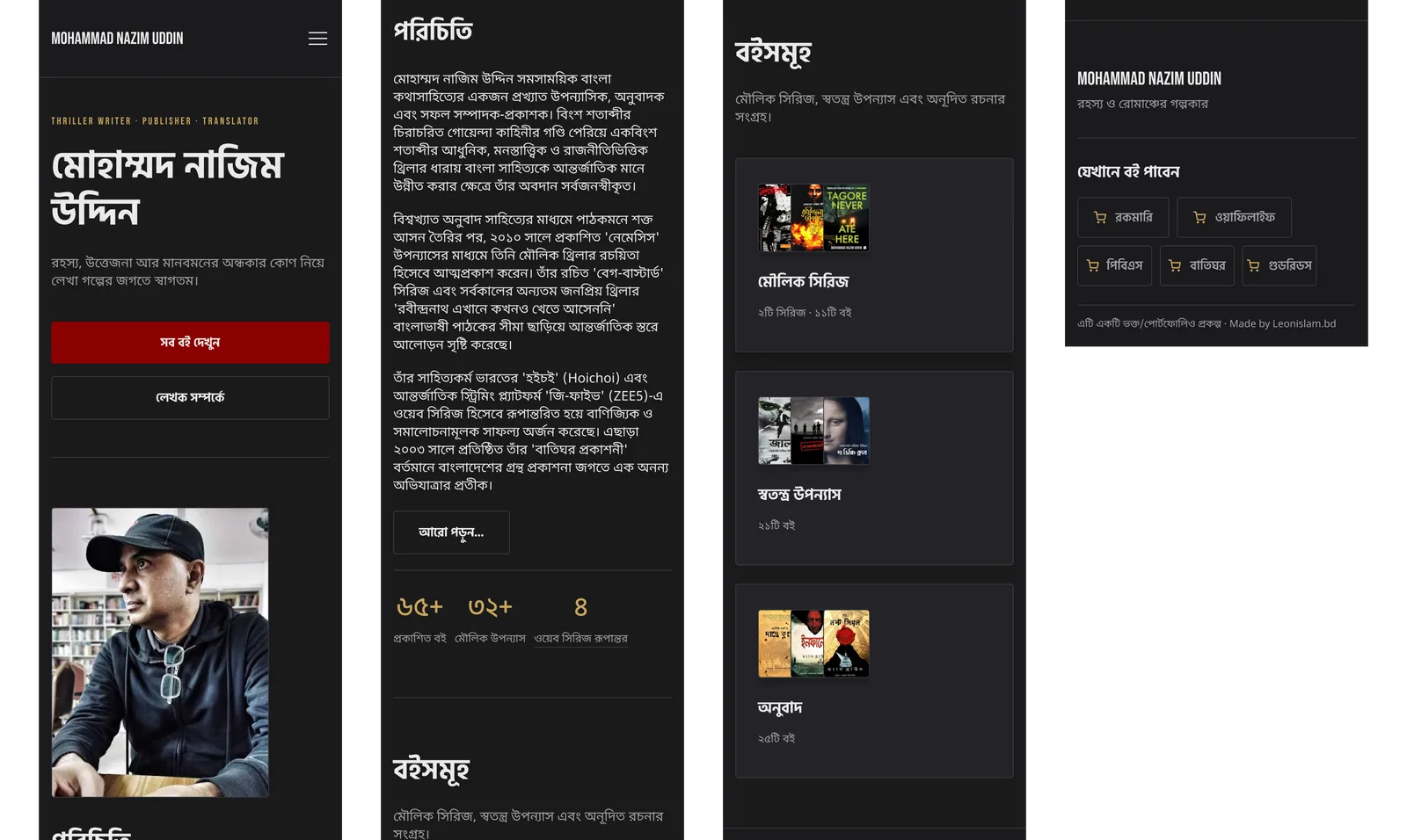
A visitor should never have to think about where things are. Navigation is limited to three clear items, and the books are grouped into Original Series, Standalone Novels and Translated Books. With 57 books in total, this shows the author's range without extra decisions.
I left out filters and search on purpose. They suit large catalogues and shopping flows, but this site is a record of the author's work. Purchase stays secondary, and each book links out to external bookstores.
Site structure
Seven pages: Home, Biography, three book category listings, Book Detail and OTT Adaptations. A book detail page can be reached from any category.
Original Series holds two series, the Beg-Bastard series and the Rabindranath thriller series. Books are listed in publication order, so readers can follow each story from the beginning.
Colour: dark, red and gold
A near-black background with a deep red accent matches thriller covers and lets the covers stand out instead of competing with the page. Gold is used sparingly, for small labels and ratings.
Cover-led grid, without filters
Covers are the main visual element, so listing pages are a clean grid. With clear categories, visitors browse without extra decisions.
Series in publication order
Books within a series are numbered in publication order. Each series page states the book count at the top, so visitors know how much there is to explore.
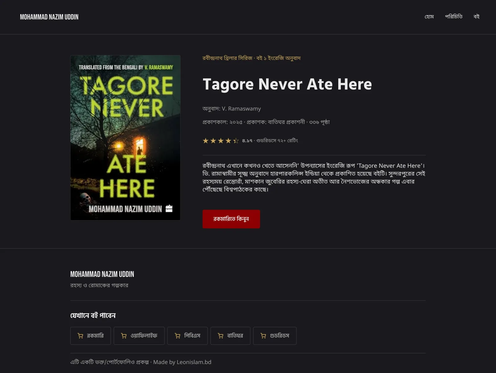
Two states for the book detail page
For available books, the page links to external bookstores. For out-of-print books, the purchase option is replaced with a disabled button. In the prototype, Tagore Never Ate Here (available) and The Dante Club (out of print) are linked as templates.
Bengali typography
Bebas Neue for the logo, small labels and English headings, for a strong, cinematic feel. Hind Siliguri for Bengali headings and buttons. Noto Sans Bengali for body text, which stays clear at small sizes and handles conjunct letters well.
Bengali text gets a slightly larger size and more line spacing than English, because its marks above and below the line need extra room, especially in long texts like the biography.
Responsive design
On mobile the navigation collapses into a menu icon, buttons become full width, book grids change from five columns to two, and wide tables are rearranged to fit the narrow screen.
Takeaways
This project taught me to design around the purpose of a site. Because it is a record and not a store, I focused on clear structure and strong covers. It also deepened my understanding of Bengali typography.
If I continued, I would test it with a few real readers to check how easily they find books, and add search or sorting by year if the collection grows.